


WordPress | Contact form 7 Snippets
Remove validation on all radio fields
remove_filter('wpcf7_validate_radio', 'wpcf7_checkbox_validation_filter', 10);

add_filter('wpcf7_validate_radio', function($result, $tag) {
  if (in_array('class:required', $tag->options)) {
    $result = wpcf7_checkbox_validation_filter($result, $tag);
  }
  return $result;
}, 10, 2);
Custom toggle buttons

Form shortcode :
[radio your-choose use_label_element class:togglebuttons "SI" "NO" ]Toggle Button Style :
.togglebuttons .wpcf7-list-item {
  margin: 0 2px 0 0;
  display: inline-block;
}
.togglebuttons > span input {
  opacity: 0;
  position: absolute;
}

.togglebuttons > span .wpcf7-list-item-label {
  cursor: pointer;
  display: block;
  color: #fff;
  border-radius: 2px;
  background: #ffffff;
  padding: 2px 8px;
  background: transparent;
  box-shadow: 0 1px 1px rgba(0,0,0,.2);
  border: 1px solid #e0e0e0;
	    border-radius: 0;
    width: 54px;
    height: 46px;
    display: flex;
    justify-content: center;
    align-items: center;
	    display: flex !important;
    justify-content: center;
    align-items: center;
}

.togglebuttons > span input:checked + .wpcf7-list-item-label {
  background: #B0D400;
  border: 1px solid #B0D400;
  color: #ffffff;
  font-weight: bold;
}

.togglebuttons{
	    margin-top: -8px;
    display: block;
    margin-left: 1rem;
}

.togglebuttons .wpcf7-list-item.first{
	margin-right:10px;
}

.togglebuttons{
	display:flex;
}


.form-with-custom-checkboxes-radios label{
	    margin-left: 3rem;
}


@media screen and (min-width: 1441px){
.col-sm-3.nw {
    margin-left: 6.5rem !important;
}
}
Custom Checkbox

[acceptance acceptance-692]Preselected Custom Checkbox

[acceptance acceptance-692 optional invert default:on]Custom CSS
/* CUstom checkbox */

.checkbox_custom input[type="checkbox"] {
    position: relative;
    cursor: pointer;
    padding: 0;
    margin-right: 15px;
    width: 20px;
}
input[type="checkbox"]:before {
    content: '';
    margin-right: 10px;
    display: inline-block;
    margin-top: -10px;
    width: 18px;
    height: 18px;
    background: #3C3C3A;
    border: 1px solid #fff;
    border-radius: 0px;
	cursor:pointer;
}


 input[type="checkbox"]:checked:before {
    background: #B0D400;
    border-color: #B0D400;
}
 input[type="checkbox"]:disabled {
    color: #B0D400;
    cursor: auto;
}
 input[type="checkbox"]:disabled:before {
    box-shadow: none;
    background: #ddd;
}
 input[type="checkbox"]:checked:after {
    content: '';
    position: absolute;
    left: 5px;
    top: 8px;
    background: #B0D400;
    width: 2px;
    height: 2px;
    /*box-shadow: 2px 0 0 white, 4px 0 0 white, 4px -2px 0 white, 4px -4px 0 white, 4px -6px 0 white, 4px -8px 0 white;
    transform: rotate(45deg);*/
}


 span.wpcf7-list-item{
   margin: 0px 0 0 0;
}

.form-with-custom-checkboxes-radios label {
    margin-left: 0;
}
Set first Option of a select “Disable”
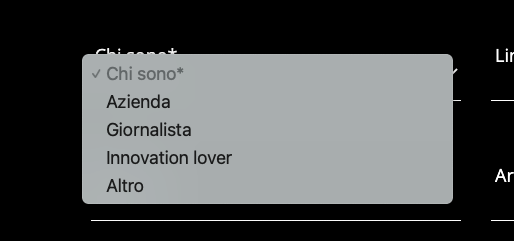
[select* chi class:chi first_as_label "Chi Sono" "Azienda" "Giornalista" "Innovation lover" "Altro"]Custom JQuery
if ($("body").hasClass("page-template-newsletter-template") ) {
$("select.wpcf7-select").each(function (index) { $(this).find("option:first").attr('disabled', 'disabled'); });
};
This tutorial’ll be updated with more tag in future .. so…
Let’s stay tuned